Brand symbol / Logotype / Typefaces
-
Brand Symbol
- The Brand Symbol
- Timeline of Changes to the Brand Symbol
- List of Basic Design Elements
- Clear Space / Minimum Usage Sizes
- When the Brand Symbol is displayed vertically
- When the Symbol Mark is displayed on its own
- Examples of Prohibited Distortions of the Brand Symbol
- Brand Colors
- Brand Symbol Display Colors
- The Brand Symbol and its Relationship to Background Colors
- Examples of Prohibited Use
- Rules for Display of the Brand Symbol using Embroidery
- Company Logo
- Designated Typefaces
- Brand Statement Logo
- Rules on Use of the Brand Symbol for Authorized Dealers and Distributors
- Other cases when the Kyocera Brand is used together with another brand
- Home
- Brand symbol / Logotype / Typefaces
- Brand Symbol
- Clear Space / Minimum Usage Sizes
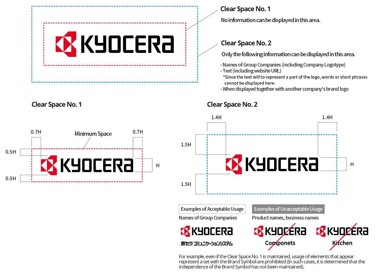
Clear Space
The Brand Symbol must be distinguished from other information and always displayed symbolically in a way that maintains its independence.
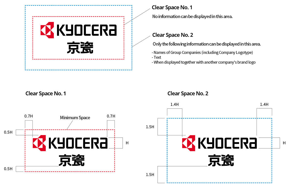
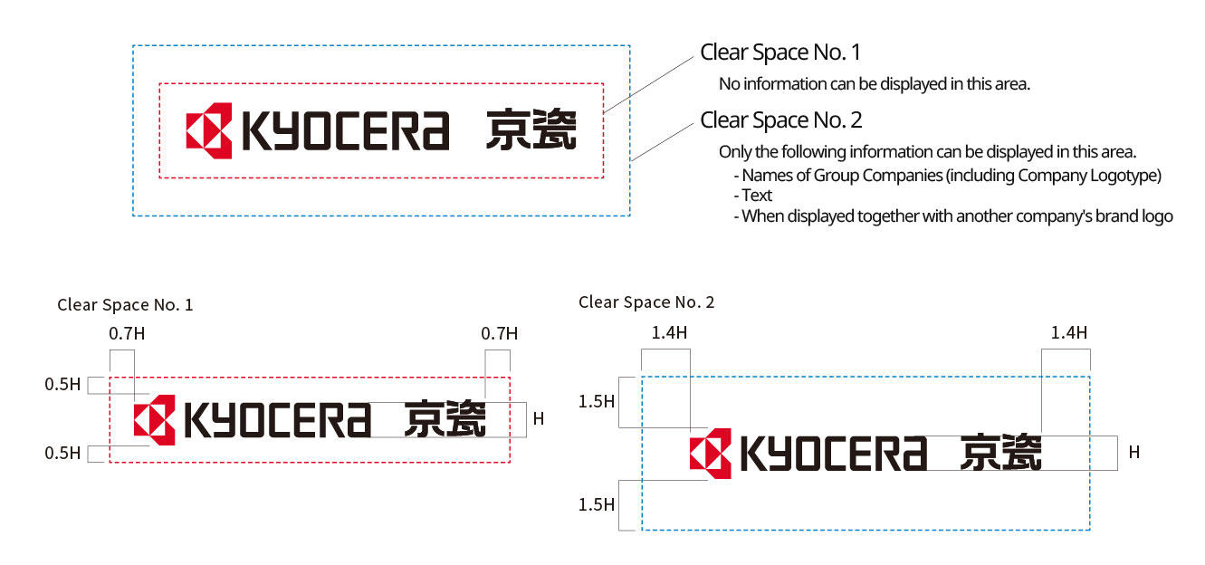
Clear Space is the minimum space required to achieve this logo independence. No other information can be displayed within this area. Always ensure that space equal to or greater than the designated Clear Space is maintained.
Also, be cautioned that the Clear Space is subdivided into areas No. 1 and No. 2.
If you are unable to secure sufficient clear space due to M & A or other business strategy reasons, you must obtain approval from the Brand Management Committee. For details, also check “Rules Concerning the Use and Management of the Brand Symbol.”

When combined with the Chinese abbreviated Company Logo (vertical typesetting)

When combined with the Chinese abbreviated Company Logo (horizontal alignment)

Clear Space for Integrated Version

Minimum Usage Sizes
The Brand Symbol must be clearly displayed at all times. To ensure this, minimum usable sizes have been designated.
Target minimum sizes are at least 15mm across when printed, and at least 60 pixels across when displayed on a PC screen.
However, when it is possible to display the Brand Symbol clearly on devices, such as a high-resolution LCD, the Brand Symbol can be shown at a size smaller than the minimum size.
Minimum Usage Sizes (Rough Indications)

