Brand symbol / Logotype / Typefaces
-
Brand Symbol
- The Brand Symbol
- Timeline of Changes to the Brand Symbol
- List of Basic Design Elements
- Clear Space / Minimum Usage Sizes
- When the Brand Symbol is displayed vertically
- When the Symbol Mark is displayed on its own
- Examples of Prohibited Distortions of the Brand Symbol
- Brand Colors
- Brand Symbol Display Colors
- The Brand Symbol and its Relationship to Background Colors
- Examples of Prohibited Use
- Rules for Display of the Brand Symbol using Embroidery
- Company Logo
- Designated Typefaces
- Brand Statement Logo
- Rules on Use of the Brand Symbol for Authorized Dealers and Distributors
- Other cases when the Kyocera Brand is used together with another brand
- Home
- Brand symbol / Logotype / Typefaces
- Brand Symbol
- The Brand Symbol
The Brand Symbol
The Kyocera Brand Symbol is the most important element in the visual identity system. The Brand Symbol represents the image and reputation built by the Kyocera Group through its business activities. With consistent and correct use of the Brand Symbol throughout all Kyocera communications, the value of the Kyocera brand will continue to grow.
The Symbol Mark is a stylization of the Kyocera ""K"" encircling the ""C"" of ceramics. The diagonal arrows branching out to the right symbolize the dynamic role Kyocera plays in the ever-expanding fields of technology.
The color of the logo is red, which represents passion and defiance. This symbol marks the central design element of the corporate statement.
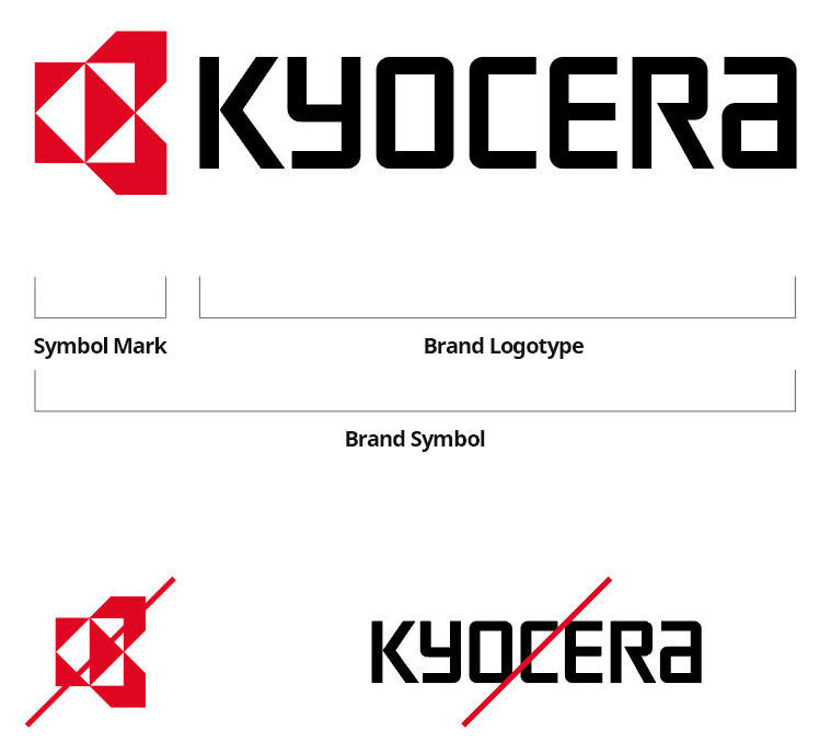
Aside from certain exceptions (see page 26), standalone use of the Symbol Mark and Brand Logotype is prohibited.