Brand Symbol Overview
Brand Symbol
The brand symbol represents the image and reputation that arises from the accumulation of the Kyocera Group’s various business activities. It is the most important element at the core of the Kyocera brand.
The Kyocera brand symbol consists of the corporate symbol mark and brand logotype. The use of these components in combination allows them to function as the brand symbol.
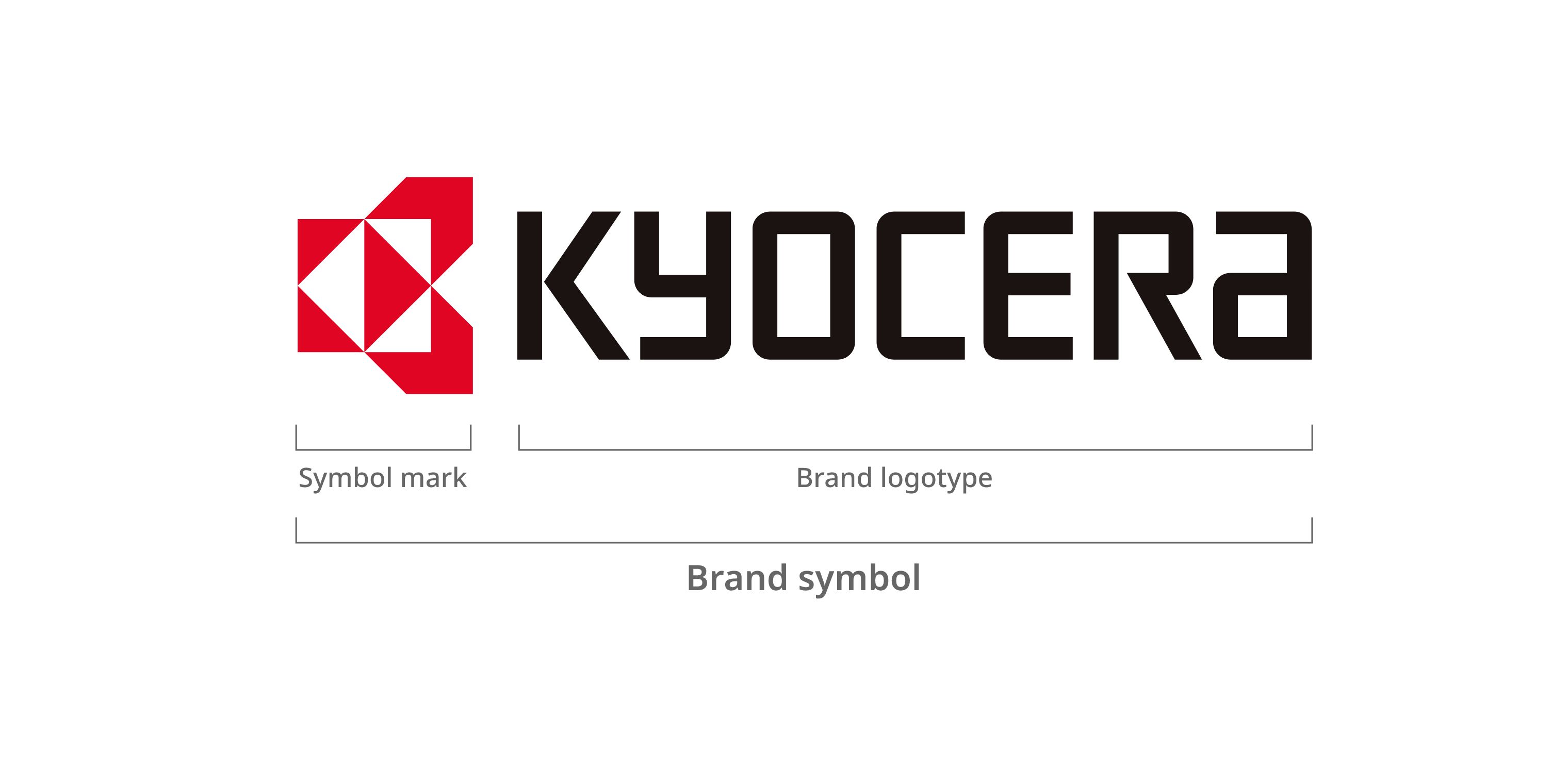
Symbol Mark
The basic shape that forms the symbol mark is a rhombus. Symbolizing Kyocera’s management philosophy, this diamond shape embodies a variety of meanings, such as “ innermost heart, ” “ origin, ” “ essence, ” “ earth or planet, ” as well as “ respect and dignity ” in Japanese culture ; “ zero " in geometry; and even “ decision " in a flow chart.
It also represents the “ K ” in Kyocera encircling the “ C ” in ceramics to express the spirit of taking on challenges, seeking broader possibilities, and leaping ahead into the future.
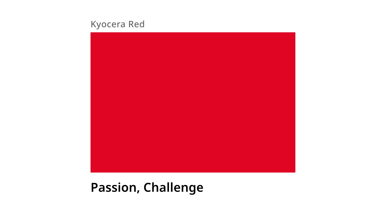
Symbol Mark Color
The color of the symbol mark is red, representing passion and a spirit of challenge.
Together with the symbol mark itself, this color serves as a central design element of Kyocera’s corporate identity, representing the company’s essence both emotionally and symbolically.
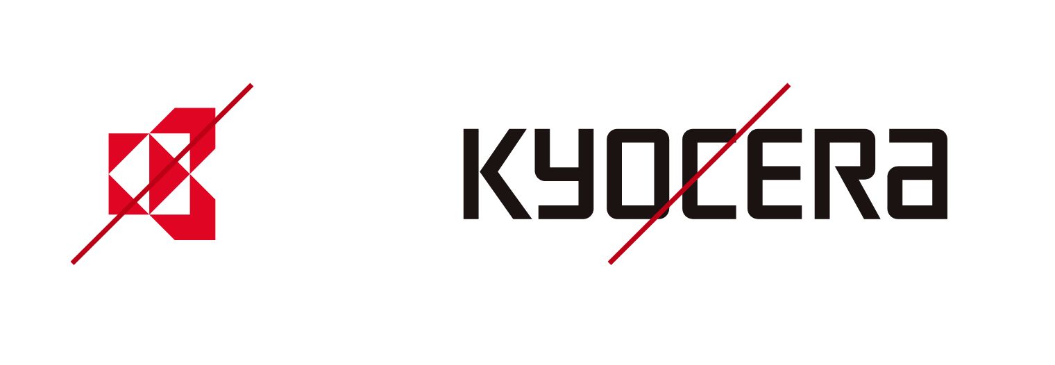
Examples of Prohibited Use
Apart from certain exceptions, the mark and may not be used independently.