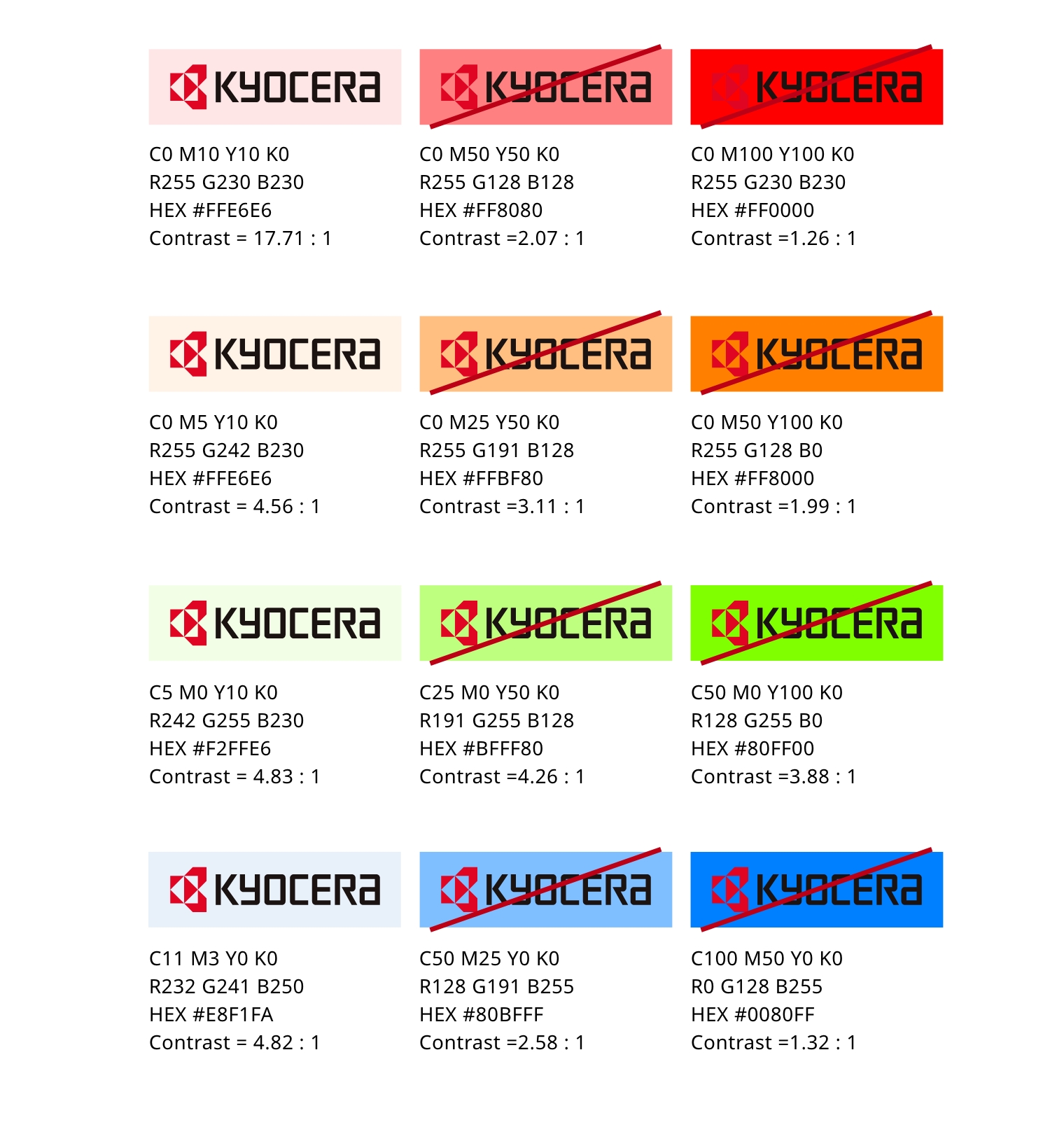
Background Colors
Relationship Between the Brand Symbol and Background Colors
The brand symbol should, in principle, be used in the three standard display colors, with top priority always given to displaying the symbol on a white background ( Kyocera White ). However, limited monochrome usage is also permitted.
When placing the symbol on a background color, ensure visibility so that it remains clear and easily recognizable at all times.
Basic Display Colors

Display on Gray Backgrounds (Reference)
When using background colors not defined in this guideline, ensure sufficient visibility by maintaining a contrast ratio of at least 4.5 : 1 with the background.
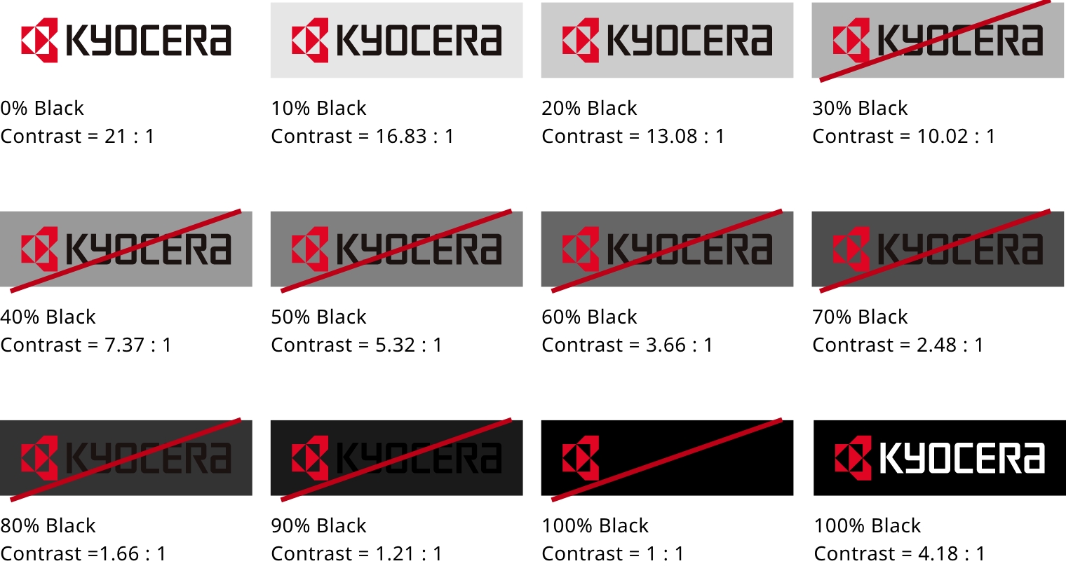
Depending on how the brand symbol and design looks in combination with a background color, usage may be designated as prohibited due to insufficient visibility even if the contrast ratio exceeds 4.5 : 1.
Reference Examples of Monochrome Display
White monochrome display is permitted only when the background is dark gray or black.

* Except under special circumstances, do not use monochrome displays that include the brand symbol.
Examples of Display on Other Background Colors (Reference)