Brand Symbol Colors
Standard Colors to Use When Displaying the Brand Symbol
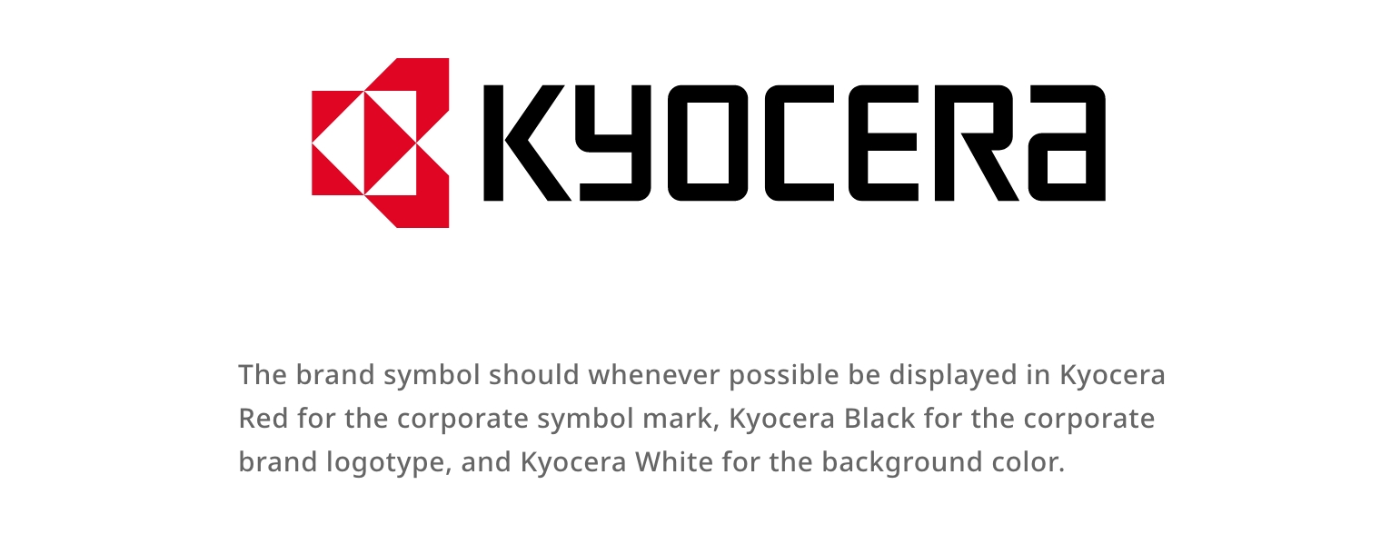
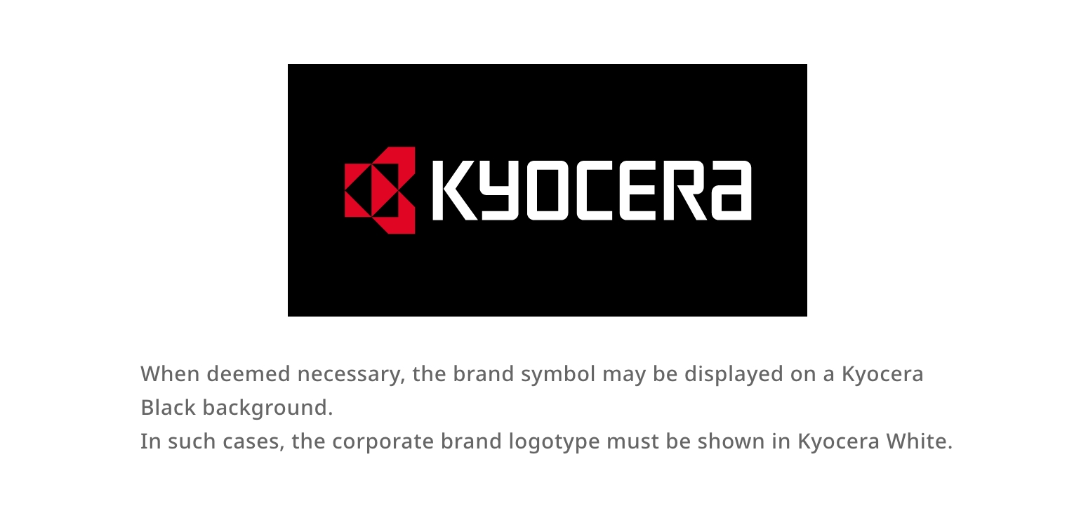
The brand symbol should primarily be displayed in two colors—Kyocera Red and Kyocera Black—with a white background ( Kyocera White ) . This is the preferred method of display. However, if the background color, type of medium, or the content to be communicated make the standard colors on a Kyocera White background unsuitable, the brand logotype may be changed to Kyocera White and the background color to Kyocera Black ( inverted brand color version ) .
The Kyocera brand is not only expressed through the shape of the symbol, but also through consistent use of its display colors. This consistency effectively enhances recognition and reinforces the brand image among stakeholders.
Therefore, please make every effort to display the brand symbol using the top priority standard display colors ( Red, Black, with White background ) whenever possible.
Top Priority
Standard Display Colors
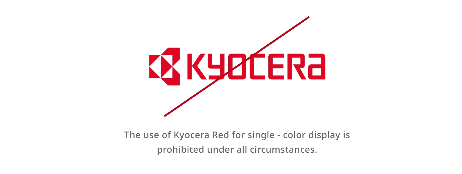
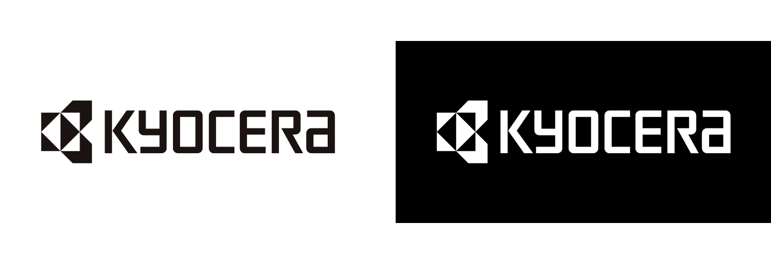
When displayed in a single color, only Kyocera Black or Kyocera White may be used.
In principle, all design materials must be created on the premise of using the brand’s standard display colors.
Permitted Usage Examples
When the Standard Display Colors Cannot Be Used
Monochrome Display ( e.g., Single-Color Printing )
In cases where printing colors are limited, special usage may be permitted. However, except under special circumstances, the brand symbol must not be displayed in monochrome.
Furthermore, except under special circumstances, monochrome display in colors other than Kyocera Black or Kyocera White—such as gold or silver—is not permitted.
Prohibited Usage Examples
Prohibited Examples of Monochrome Display